Monday, October 22, 2012

MIAD: On My Own


I absolutely love street art. I think it is amazingly courageous to put your work out there for everyone to see and openly criticize. It's also extremely difficult to attempt to decipher what the anonymous artist is trying to say - their message, so to speak. For example, this particular piece of art was slapped onto a random billboard on the streets of Milwaukee, and I have absolutely no idea what it's supposed to mean. However, whenever I look at this, it just puts the biggest smile on my face. I love cats - because, honestly, who doesn't? - and as simply as this seemingly is, there's something about it that intrigues me. Like I said in my previous post, simplicity is kind of what I look for in terms of inspiration. And street art, from a graphic arts point of view is very cool to me.


I feel like the detailing and intricacy of this statue is absolutely beautiful. Again, as I said in my previous post, I love artists that pay extra attention to detail in order to make sure their art is as realistic as possible. The beading and facial features are especially impressive in terms of detail work, along with the rest of the clothing. I love the rustic gold texture overall, as well. As a whole, this statue intrigued me based on its overall complexity and contouring in terms of 3D sculpture.


This photo makes me smile as well as I know exactly what was going on during the time that it was taken, and exactly how happy Kate really was. ;) Anyways, I think this photograph actually turned out better than expected. I love the way the natural lighting hits her face and accentuates her facial expression. I also like the shadowing behind her against the texture of the brick wall. The slight diagonal that the lines of the brick wall creates a interesting contrast to the vertical orientation of the photo as well.

Wednesday, October 17, 2012

MIAD: Galleries

I really love art that is fairly simple, but still packs a punch. Pieces that are able to make an impact, without being too over-the-top, are generally the pieces that I am attracted to. I think that's something that these three pieces have in common. They are beautiful and thought-provoking without being too crazy.


This was probably the most interesting and creative piece that I came across. While part of the ladybug was created on the pipe, the rest of the right half was finished on the back wall. The two walls were a good ten feet apart, but when viewed from just the right angle, it becomes one whole piece. As I said, something so simple can become something so beautiful and different that catches the attention of someone like me. I'm not sure what the compositional technique was, considering it wasn't on a traditional canvas. However, it was clear to me that the artist focused intently on shape and texture, while paying close attention to detail. I think a great impact was made by just using black for the outlines and shadows, while leaving everything else up to whatever was on the wall.


Another all black piece, or pieces, these three really caught my eye. This looks like it could have been done by the same artist as the first one, however, I don't think so... Anyways, like the first piece, there is a lot of detail work going on. Every small little detail is planned out and executed beautifully to create a string of work that all go together. I also fell in love with the fairytale theme with a dark twist. These kind of reminded me of the movie The Nightmare Before Christmas, and I liked that I could make that connection, as I'm sure that's what the artist was going for - to get everyone to be able to make their own connections. I think it was strong to choose to center each piece, as the focus should be put on each piece as a whole. Again, I think the monochromatic look is a strong aspect. This is the kind of art that makes me say, "Wow, I wish I could do this."


I enjoy art that is different. This is definitely different. It's definitely not your average media. I love the simplicity, again, of this piece. In person, it was kind of hard to look at, seeing as there's all this light being projected at you, but when I took this picture, it created the absolute coolest shadows behind it. I love the circle of light behind it, and how the top of it is light, while the bottom of the photograph is dark. I love that contrast. Again, I love pieces of art that are simple, but that still mean something. I love the word subliminal and think this piece is just great. Again, this piece is also sort of monochromatic, but focuses more on light, which is what the whole piece is kind of about. I don't know why, but I'm attracted to more simple artwork, because I think then you have to think harder to make a connection, or to figure out the concept, which I think is fun. :)

Wednesday, September 19, 2012

Word Project Research

Here are the links I used in order to research my word:

Merriam Webster ; The Free Dictionary ; Google Images

I wanted to use at least two different dictionary websites in order to get a clear understanding of what my word means. The two definitions were of course similar, however, had different aspects of them that when put together, I got one clear definition.

I also wanted to use Google Images solely for inspirational purposes. I simply typed my word in the search bar and reviewed whatever came up. I wanted to be able to visualize what my word could have looked like. Obviously, I came up with my own, personal ideas. However, Google Images was a good place to start in order to get a beginning idea.

Monday, September 3, 2012

Milwaukee Art Museum

I have been to the Milwaukee Art Museum several times throughout the years and I feel like each time I go, I find something more unique than the last. Of course, I love exploring the photography exhibits, but I am also fascinated by all the paintings the museum has to offer, just because they are so astounding to me, knowing I could never do something like that. Exploring the website, there are a few interesting exhibits coming up that look very interesting. (Ex. Color Rush) AP Art field trip, possibly? :)

For my volunteer last year, I worked in the district office, helping to write articles for the school newsletter. I wrote one on the Scholastic Art Competition in which students from our school were awarded with having their artwork shown in an exhibit at the Milwaukee Art Museum. I hope one day that I will be given the same opportunity, because that would be a dream come true.

Summer Soundtrack: Imagine Dragons


Goodbye, Summer 2012.

It's time to begin, isn't it?
I get a little bit bigger, but then I'll admit
I'm just the same as I was
Now don't you understand that I'm never changing who I am

Wisconsin Arts Board

On this website, I discovered a contest called Poetry Out Loud, sponsored by the Wisconsin Arts Board. A contest like this gives young adolescents the opportunity to share their original poems and receive feedback and energy from their audience. I consider poetry and writing in general to be a form of art. For people who are passionate about their writing creates art with their words. I, myself, am an avid writer. The way I put words together to make a story is relative to the same process in which I put together a photograph. Although, I've never really dabbled in poetry, I've always found it interesting and elegant. I think words can add an amazing sense of character to a photograph, painting, or drawing. It can add so much more life and personality and voice. I love the correlation between the two, and plan to use this technique in my future photography endeavors.

Wednesday, August 29, 2012

Portal Wisconsin

Upon logging onto this website, I immediately clicked to photography. I was drawn to several different photographs that highlighted nature and the different aspects of it. I found these beautiful photographs that use nature and nothing else. These are the types of photographs that I could see myself taking, things that inspire me. I like the idea of using what is already beautiful and already available to me in order to capture my photographs. These photos in particular caught my attention.

Jodi Anderson
medium: photography
North Shore Winter
Photography
Digital/computer
Year created: 2008
Dimensions: 9 x 6 inches

In the first photograph, I was specifically drawn to the texture that the snow creates on the trees. All white, but still with dimension. The contrast of the pure snow with the dark wood is also very appealing. The direction of the road leads you to wonder what is at the end.

Jodi Anderson
medium: photography
Umbrella
Photography
Color
Year created: 2008
Dimensions: 9 x 6 inches

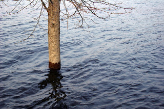
In the second photograph, the compositional technique of rule of thirds is being utilized, which is my favorite. To be honest, I don't really understand what is going on in the photo, but like in the first one, the contrasting of textures is amazing. The soft horizontal waves of the water along with the rough vertical wood makes it so that I don't want to look away.

Michael Crowley
medium: photography
Be My Valentine - Albino Whitetail Deer
Photography
Digital/computer
Year created: 2008
Dimensions: Variable

The third photograph is an example of animal photography. I absolutely adore animal photography and the way in which you can zoom in on the animals and see details and emotions that you wouldn't necessarily see or remember without having done so. One of my particular favorite photographers happens to be Alan Maltz. He does beautiful, amazing animal portraits that absolutely take my breath away. (Example) This particular photograph from Portal Wisconsin caught my eye from the expressions and the eyes of the deer. Like I said, animal photography can create emotions within the animals themselves.

Michael Crowley
medium: photography
Canoe Country - Manitowish River
Photography
Digital/computer
Year created: 2010
Dimensions: Variable

I think it's fairly obvious, but this fourth and final photograph is absolutely gorgeous. The saturated colors add life and beauty to the photograph. Your focus is not only on the two subjects in the canoe, but on all of Mother Nature's beauty surrounding them. The green foliage contrasted with the tiny pops of vibrant red here and there make for a beautiful color palette that adds to the photo. The interesting cloud formations and beautiful, bright blue sky don't hurt either.

Tuesday, August 7, 2012

Summer Soundtrack: Coldplay


When she was just a girl
She expected the world
But it flew away from her reach
So she ran away in her sleep
-
She dreamed of para, para, paradise

Latest Additions to My Flickr

Here are a few photographs that I have taken over the past couple of weeks that I feel deserve to be shared and discussed.


I really like the expression on Kate's face in this photo. In reality, she was just reviewing a photograph she had just taken, but when looking at this photo, it appears as if there's much more going on. It gives the viewer something to think about. They can interact and fill in the blanks for themselves, which is one of the things I love most about art.


For this photograph, I used my 55mm-250mm lens which was a good choice as I was able to capture the raw detail and beauty of this dragonfly. I love the different tones and textures that you can find and how that in the dragonfly contrasts with the rock it sits on. Capturing detail is one of my favorite aspects of photography.


Rule of thirds is absolutely my favorite compositional technique to use. I feel like when I use rule of thirds, it just alters the entire photograph. It adds a unique touch that I feel is not as well achieved with other types of compositional techniques. It adds life.


Another one of my favorite things about photography is the spontaneity of capturing a photo that you weren't even expecting. This was one of those photos. Sun pictures are usually hard to capture because of the overly harsh lighting in one particular area. However, this photography turned out absolutely beautiful, in my opinion. The light from the sun is gathered at one point off-center - rule of thirds - and darkened everything else around it, which adds the perfect density of contrast.


The textures in this photography are so interesting. The rough concrete surface, the sharp cracks, and the smooth but rustic metal all come together to create a contrasted group of textures. I like how the cracks, although crooked, create leading lines that spews out in all directions. The effect is definitely positive.


This photograph reminds me of how an element as simple as angles can change a whole photograph. By taking this photo from underneath the basketball hoop, it gives a whole new perspective on what you think you might be looking at. You may have to look twice. Angles are definitely an aspect of photography that I would really love to improve upon.

And now some lyrics just because I can.

I'll let you fly around in my head
Every thought is yours so let it be said
We can paint our love outside of the lines
Be original for once in our lives

Thursday, July 5, 2012

Baby, You're a Firework: Instagram


Remember when you were my boat and I was your sea?
Together we'd float so delicately
But that was back when we could talk about anything

Monday, June 25, 2012

Design


As we go on, we remember
All the times we had together

As of late, I have not been the least bit inspired in my photography. So instead I decided to showcase the collage I designed as a graduation present to Sam, and a prop for his grad party. I took Design this past year and it really got me interested in the more digital side of art. I got to play around with Adobe Illustrator which I had never used before and was able to create some really nice projects with it. So, for this collage I got to place things where I wanted and got to make it look how I wanted it to look. I think it turned out really nice. I am ready to do more design-related pieces in AP Art next year and am looking towards more of an emphasis on graphic design for my 2D portfolio.

Thursday, June 14, 2012

If You're a Bird, I'm a Bird


They said if I think with my heart that I won't get very far
But that can't possibly be true
I don't wanna know what life would be like without you

Tuesday, June 12, 2012

Because I Miss Him


I do want you to know
I hold you up above everyone

No, I did not take this photograph. And yes, he's been gone for less than 48 hours. But I miss him. Although, he's finally growing up. He's becoming a man, and for that, I am extremely proud of him and everything I know he can and will accomplish.

My brother, my best friend.

Summer Soundtrack: All Time Low


Well, they can take, take, take the kids from the summer
But they'll never, never, never take the summer from me
It was the very first time that I lost my mind for a week
-
Everybody's living like they're crazy in love

For me, this summer is all about photography and music. I am fascinated by the way in which art and music relate and how they can become one. This is why you will see me adding lyrics to every single one of my posts. The photos I take and the music I listen to show who I am.

Both influence me. Both inspire me.

Monday, June 11, 2012

Forgive and Forget


You tell me that you need me
Then you go and cut me down
-
It's too late to apologize

Monkey Bar Inception


Tonight, we are young
So let's set the world on fire, we can burn brighter
Than the sun

Tonight, goofing around and letting loose on the PLE playground brought me back to much simpler times. Times of juice boxes, cooties, and hair bows. I was able to breathe in the summer air and think about what life was like back then. The world was innocent. Reminiscing for a moment, I was happy.

I imagine this row of monkey bars to be a portal that takes me back to those times. When issues today didn't even exist.

Katherine Rose Knepprath


She, she is the words that I can't find
How can the only thing that's killing me make me feel so alive?

Wednesday, June 6, 2012

Cheers to Summer


If I could find you now, things would get better
We could leave this town and run forever
Let your waves crash down on me and take me away